


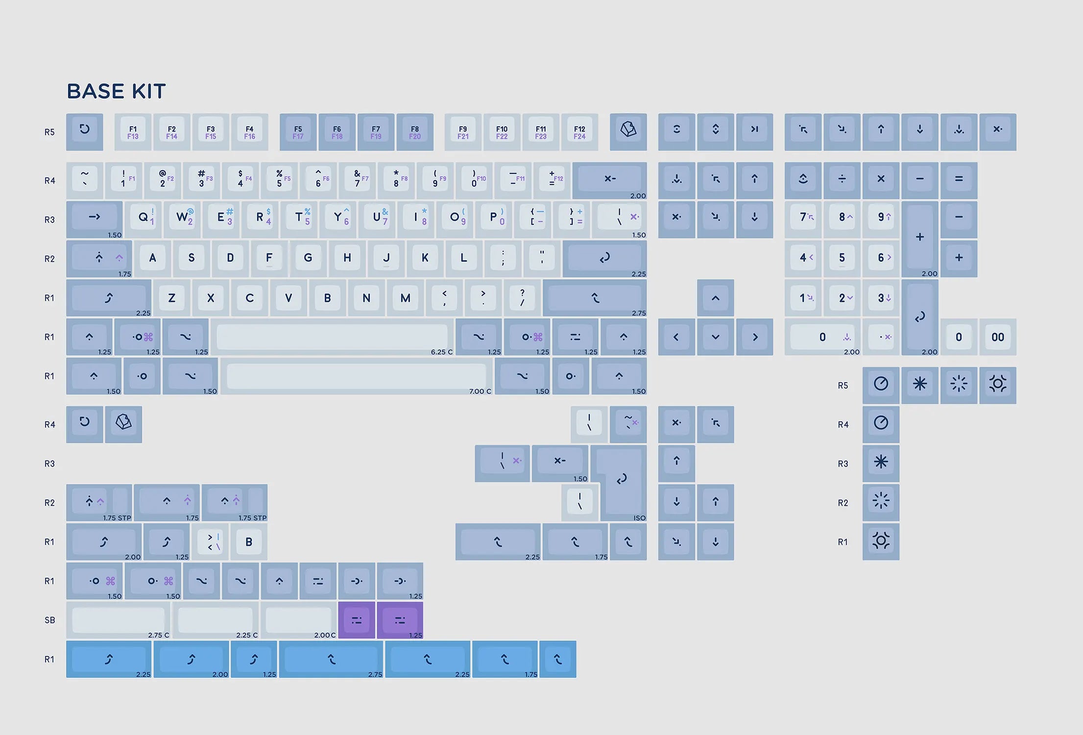
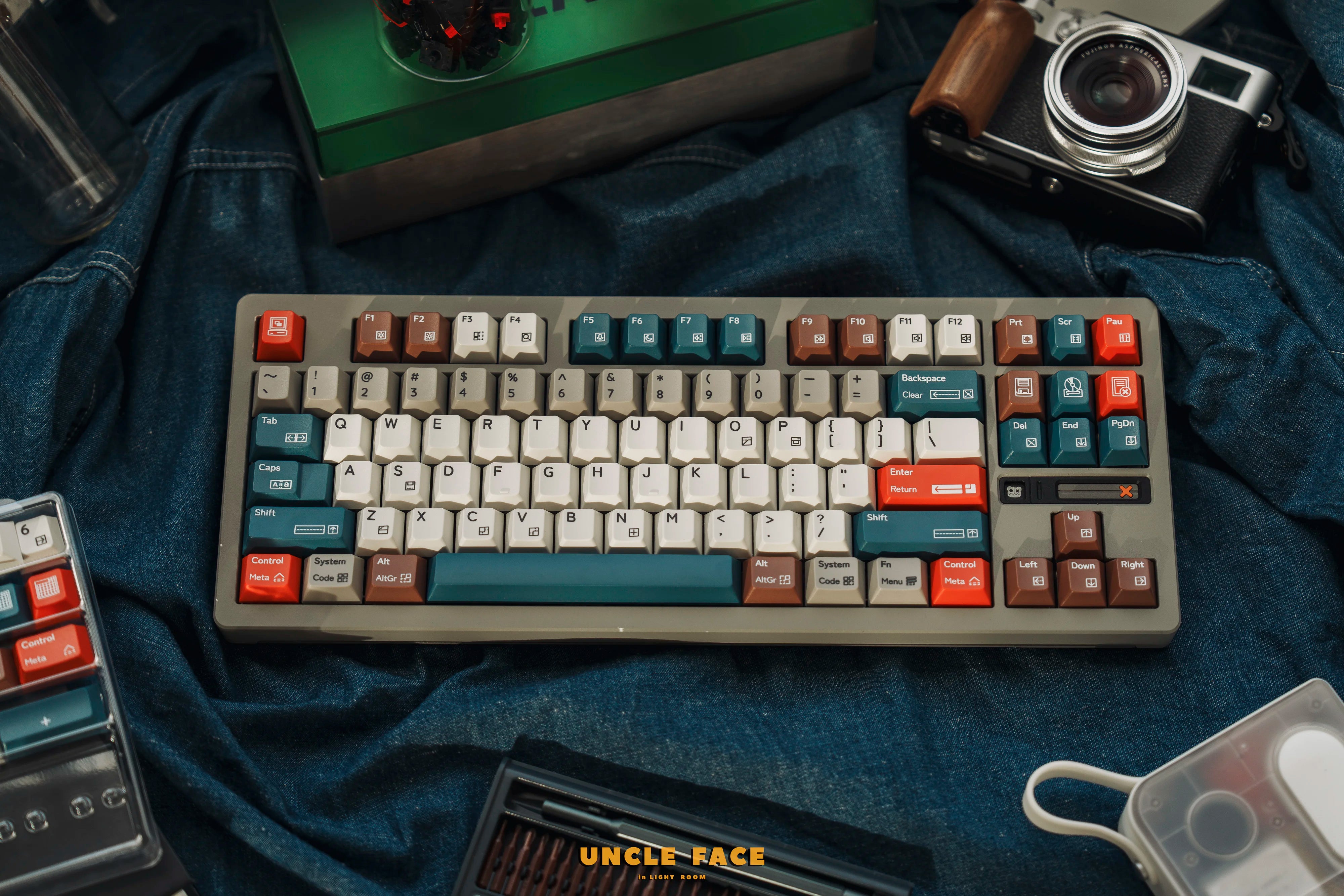
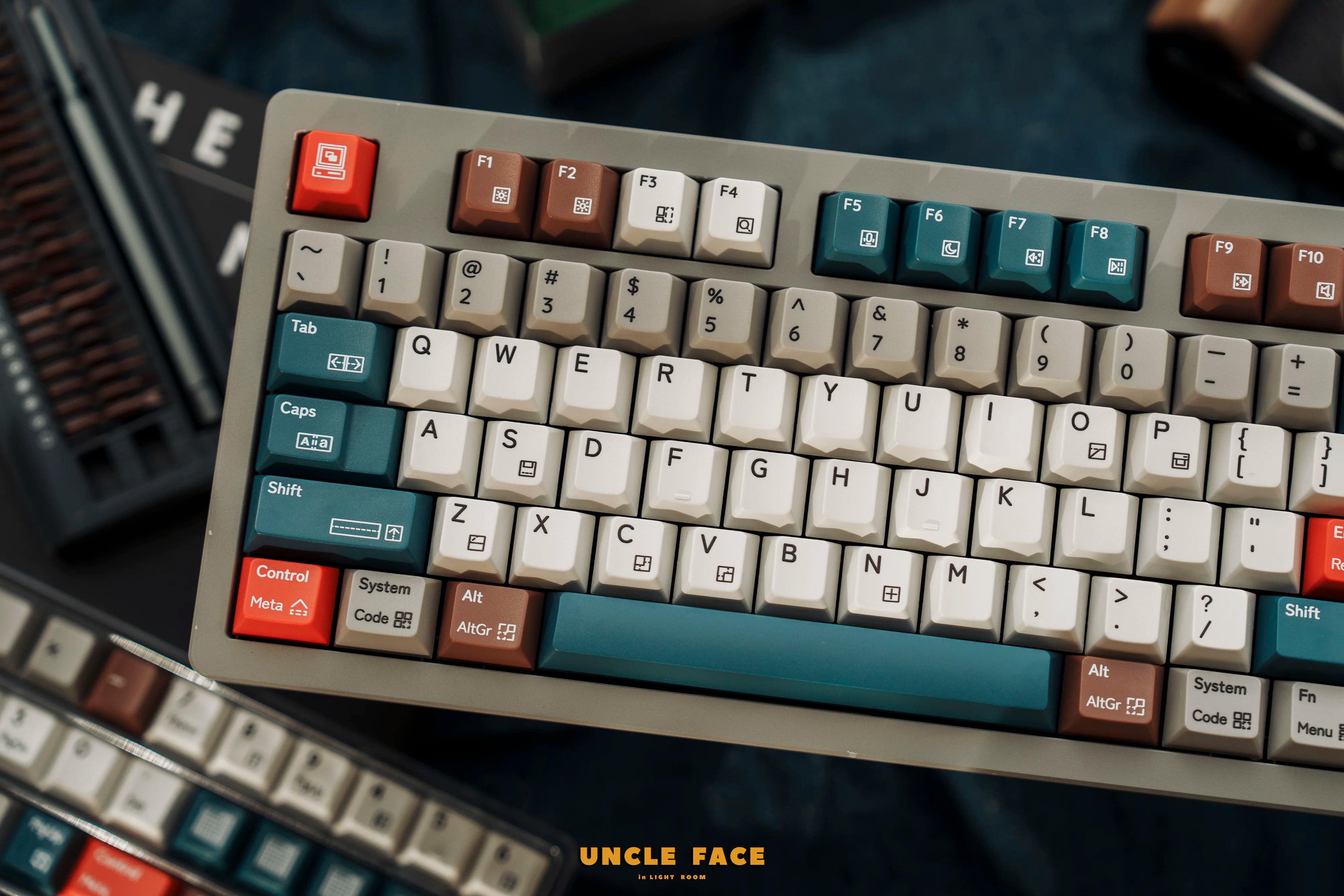
KAT Operator Thickened Double Shot PBT Keycaps
We' ll include IOSS and VAT codes for shipments to Europe& UK.
KAT Operator Thickened Double Shot PBT Keycaps
Sale price$15.30 USD
Regular price$18.00 USD (/)

Designed by Biip
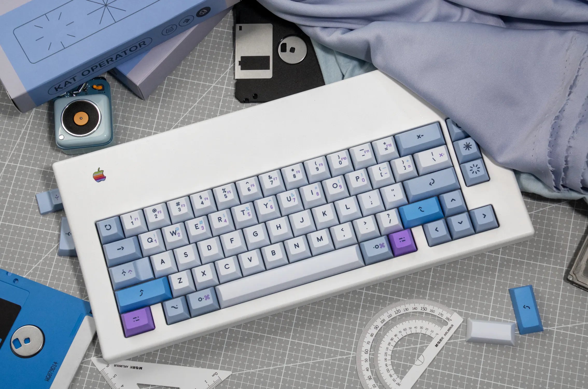
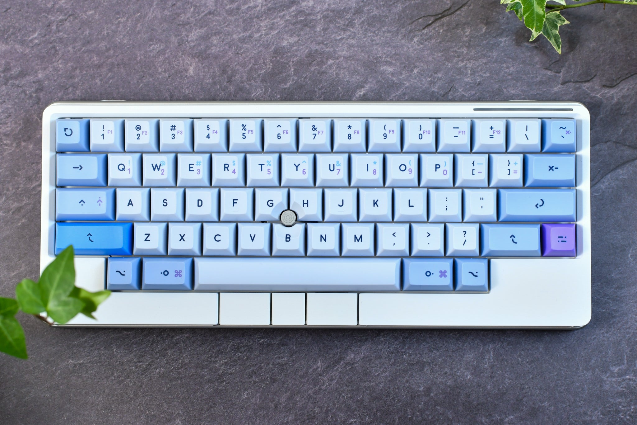
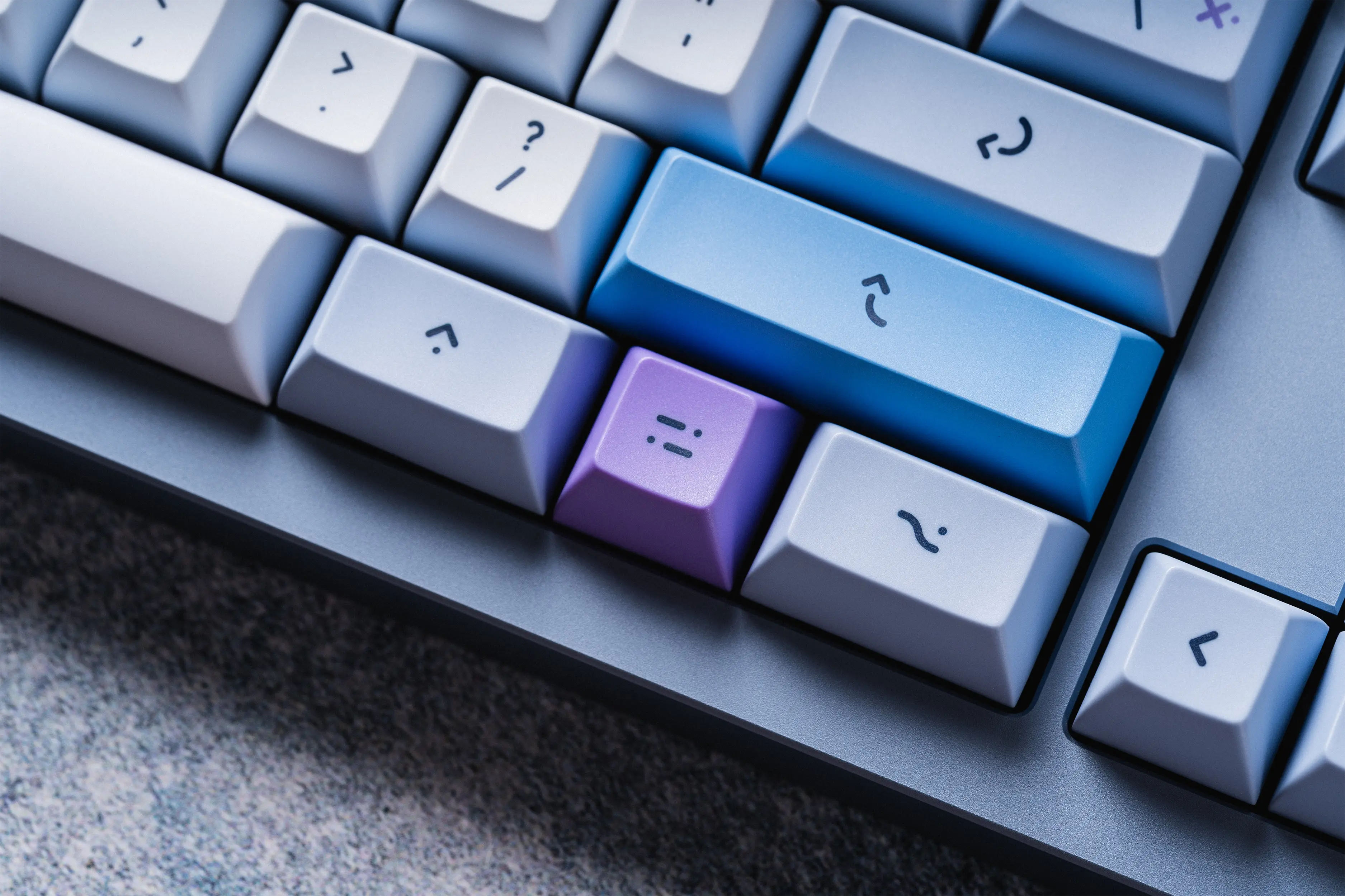
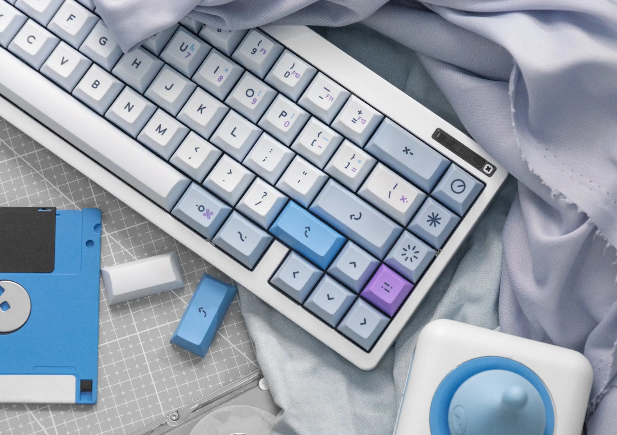
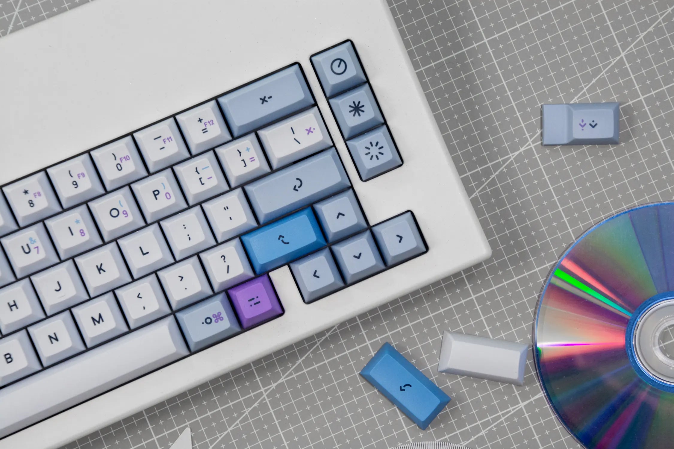
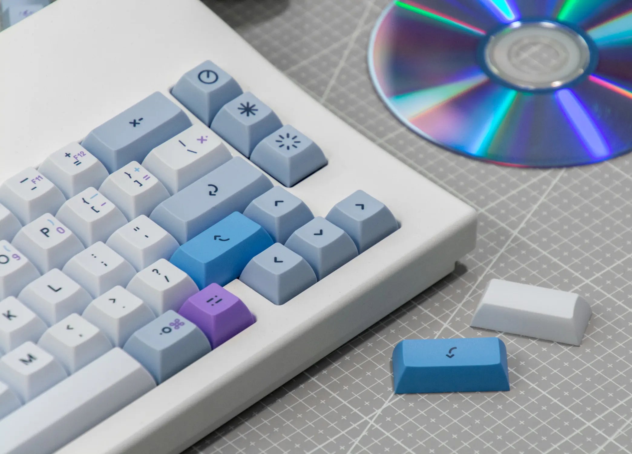
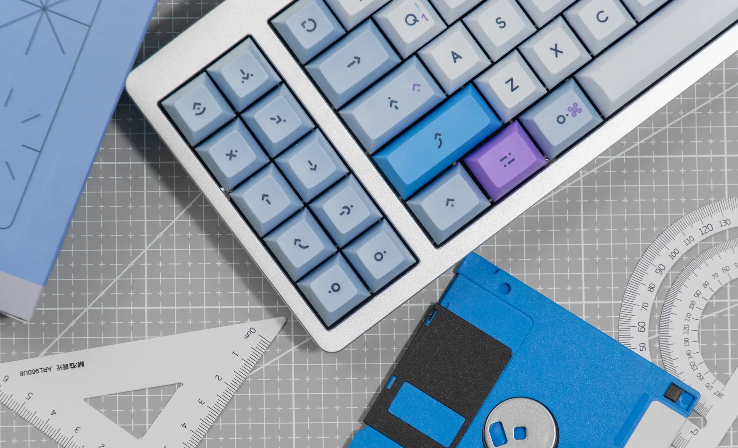
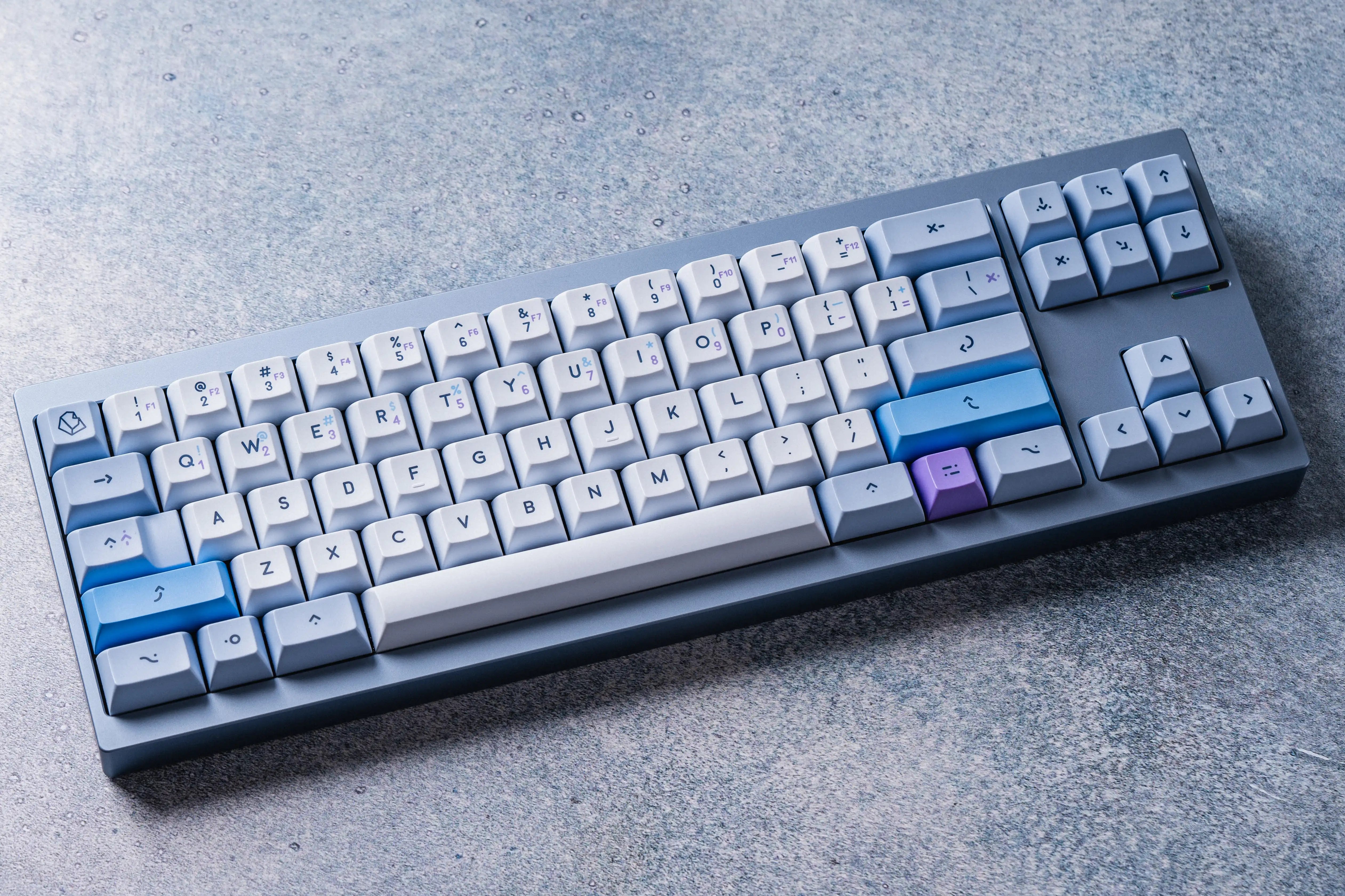
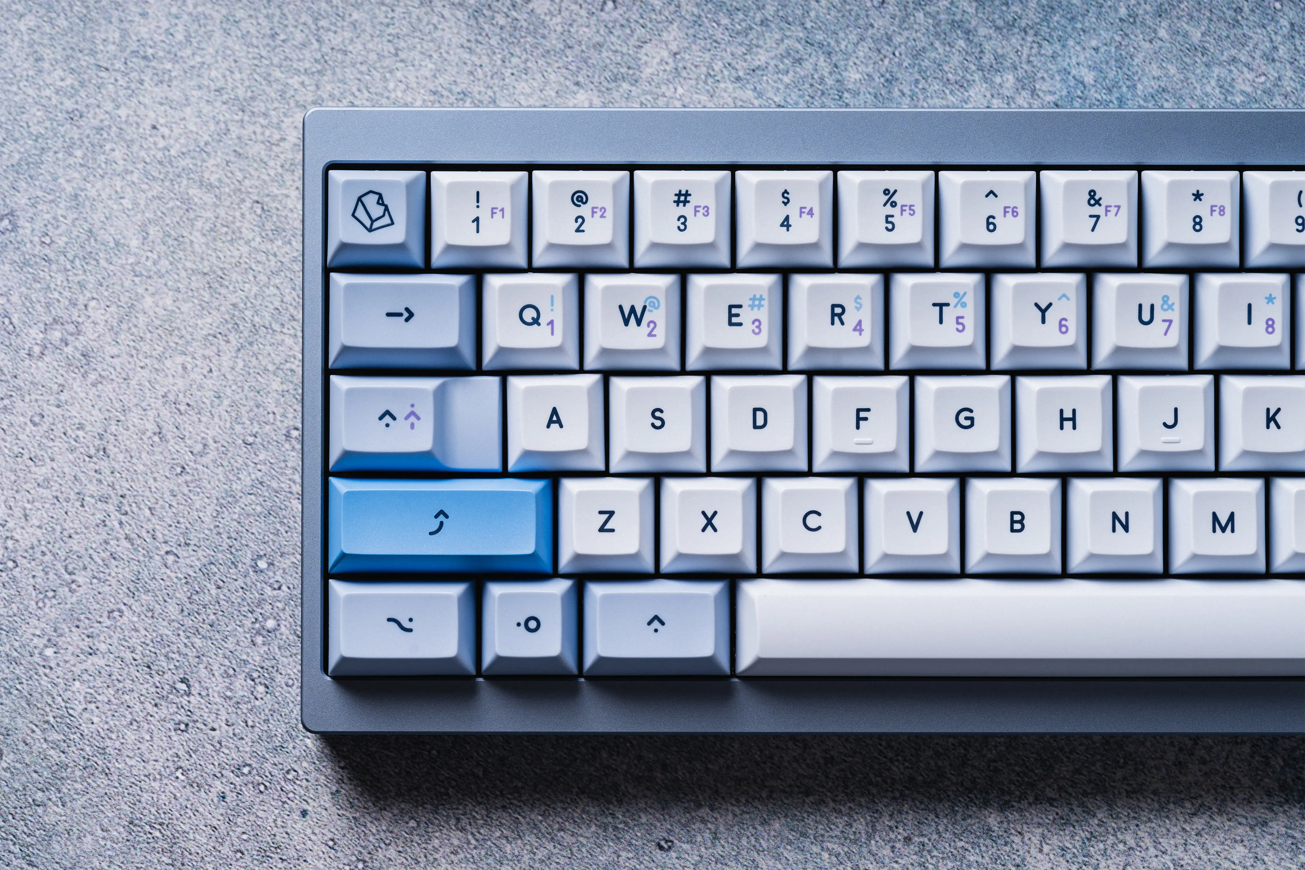
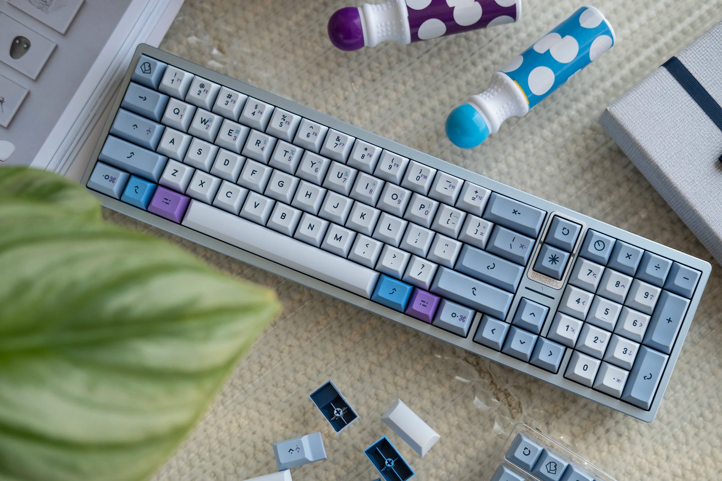
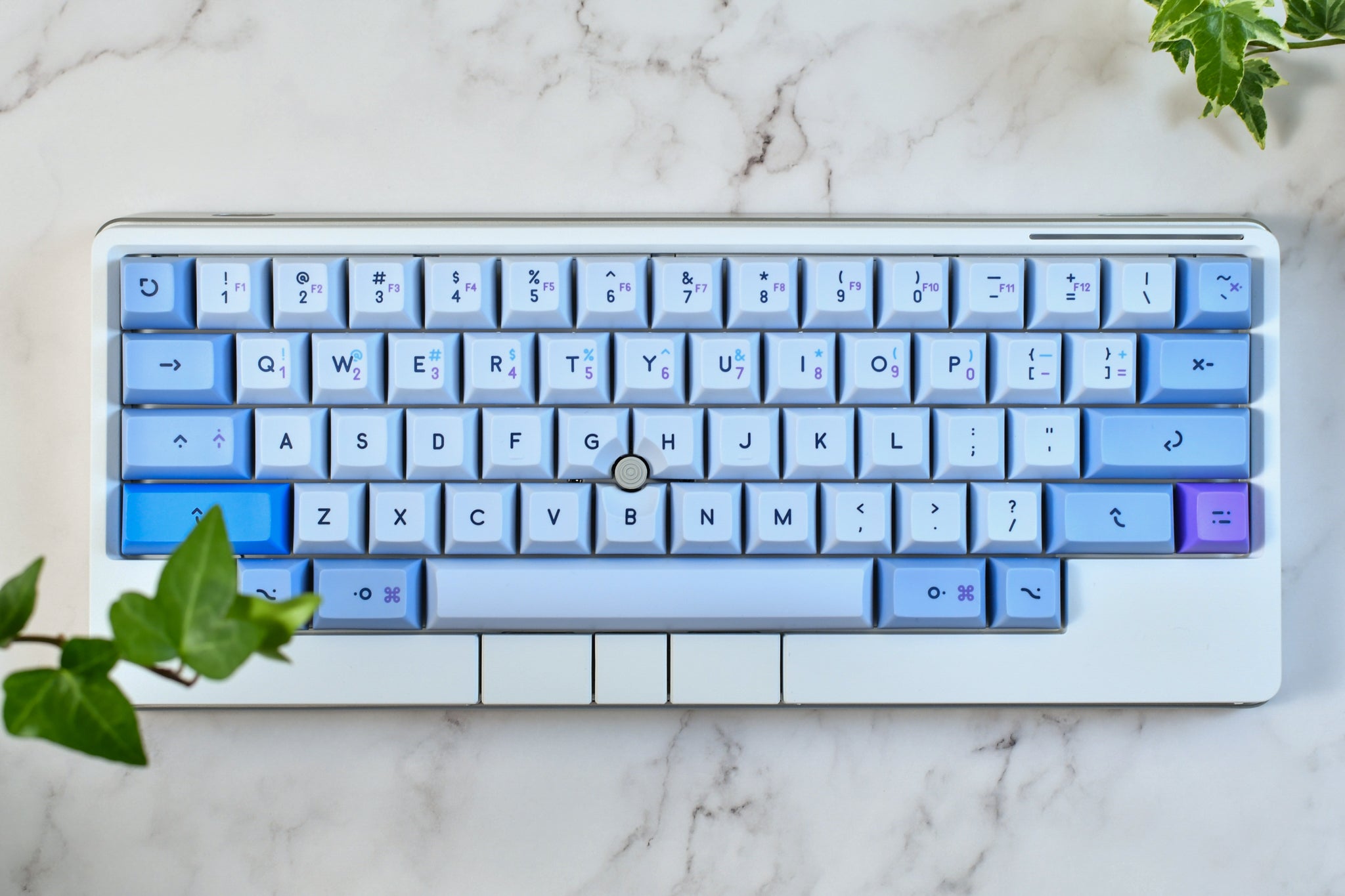
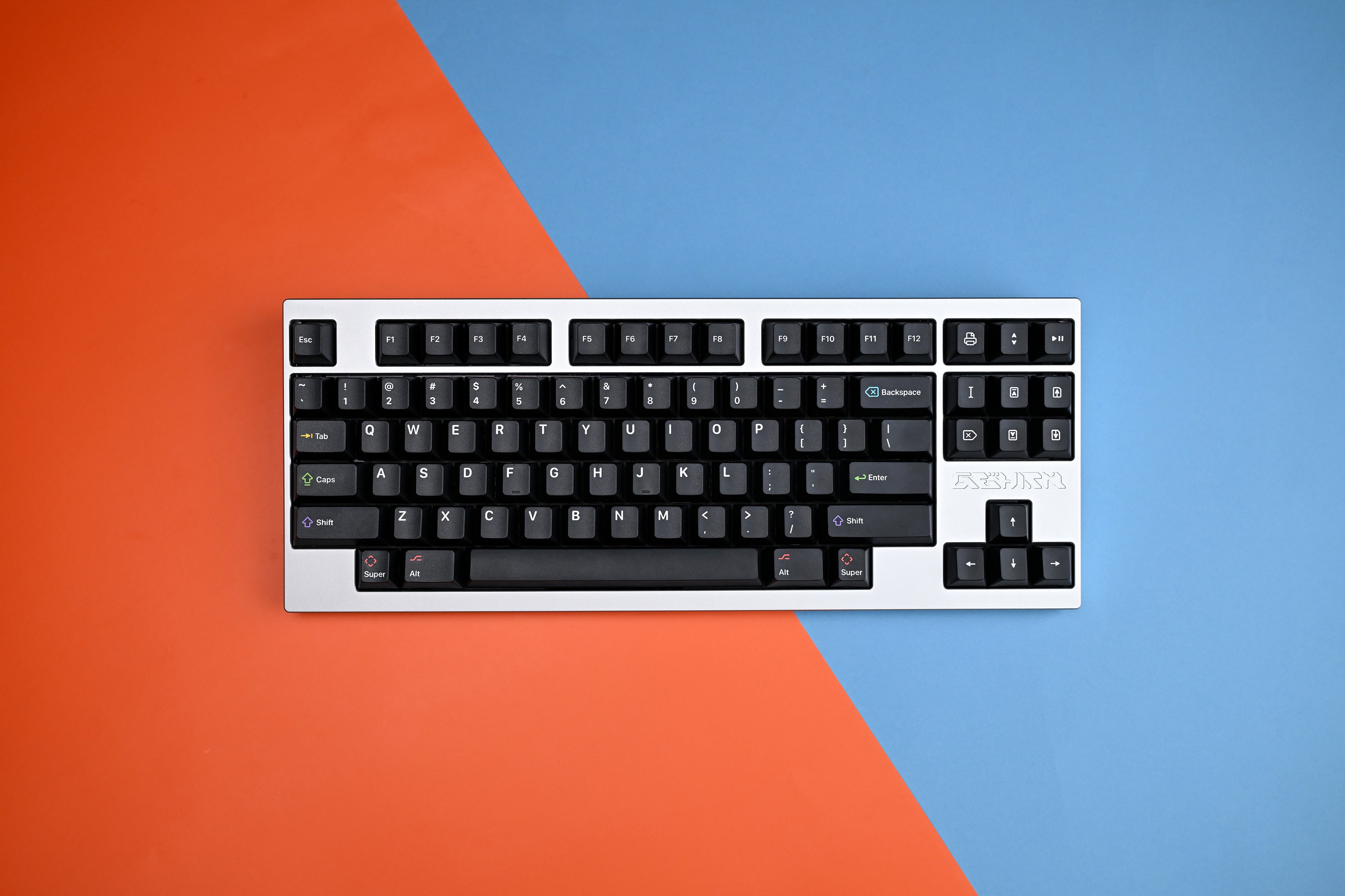
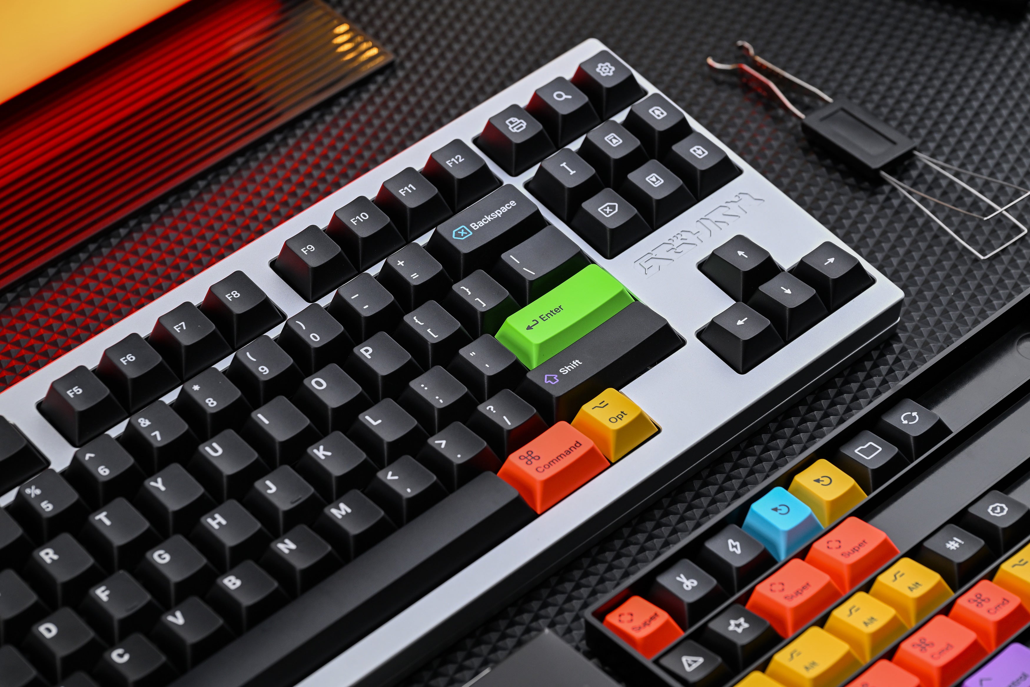
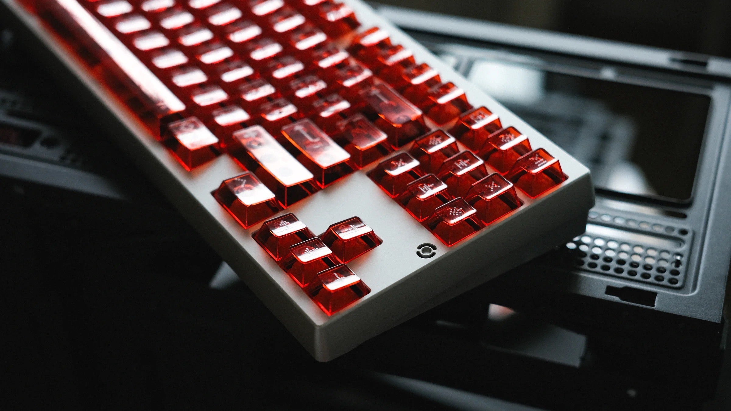
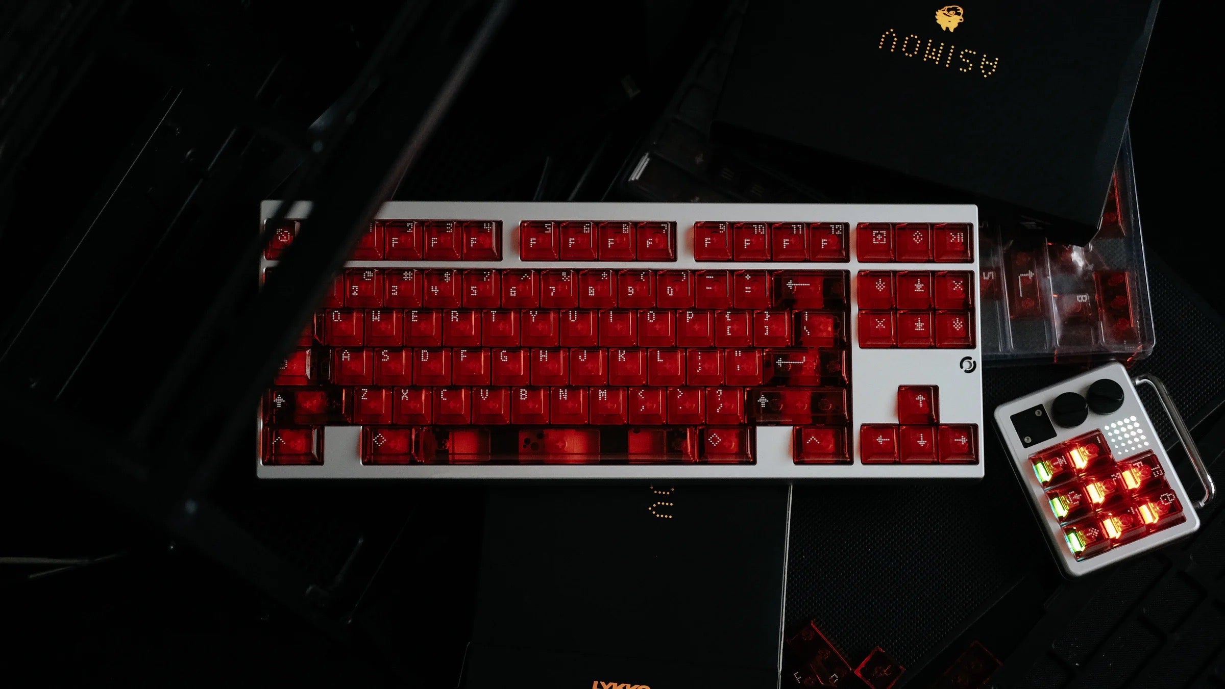
KAT Operator draws inspiration from functional industrial design, using the milkshake font style. The main color scheme is vintage grey, providing an organized and retro feel. Neutral tones are used as accent colors to distinguish the upper rows, additional layers, and functional areas, creating a subtle yet distinctive character.
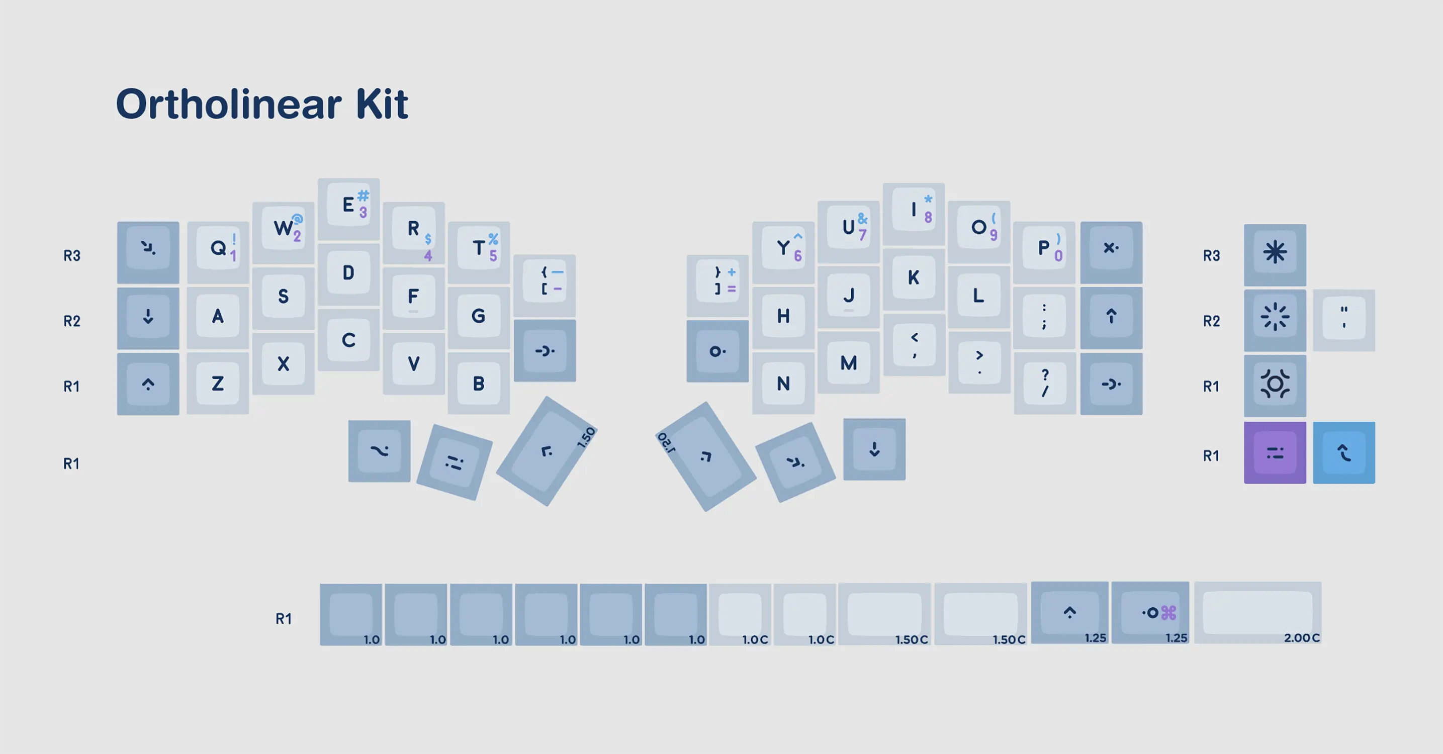
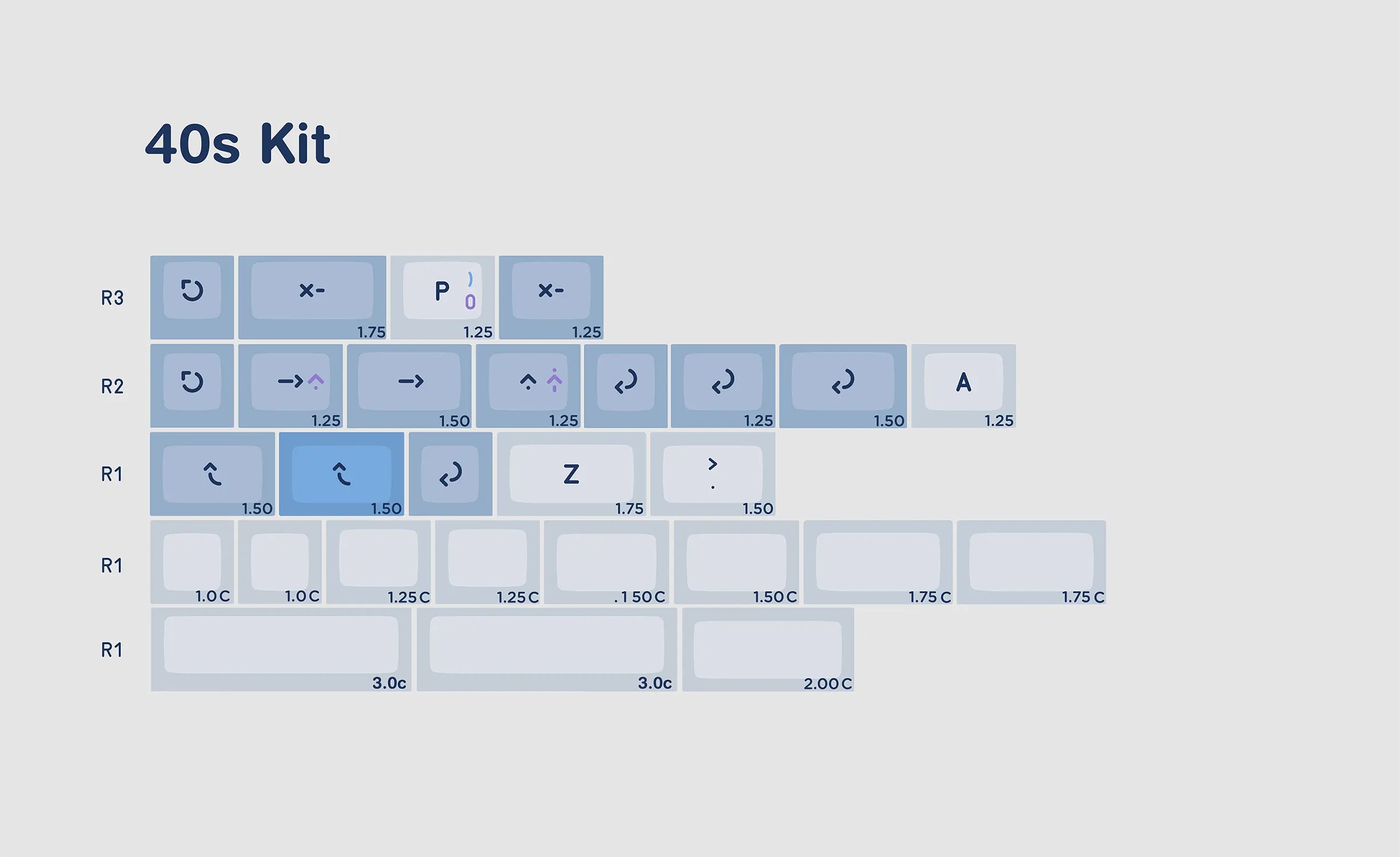
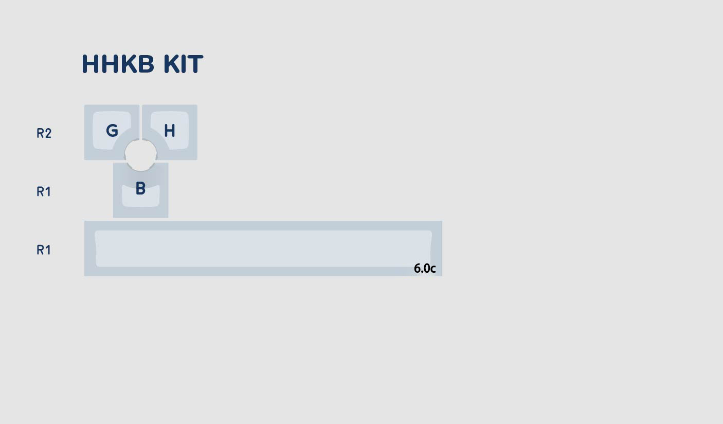
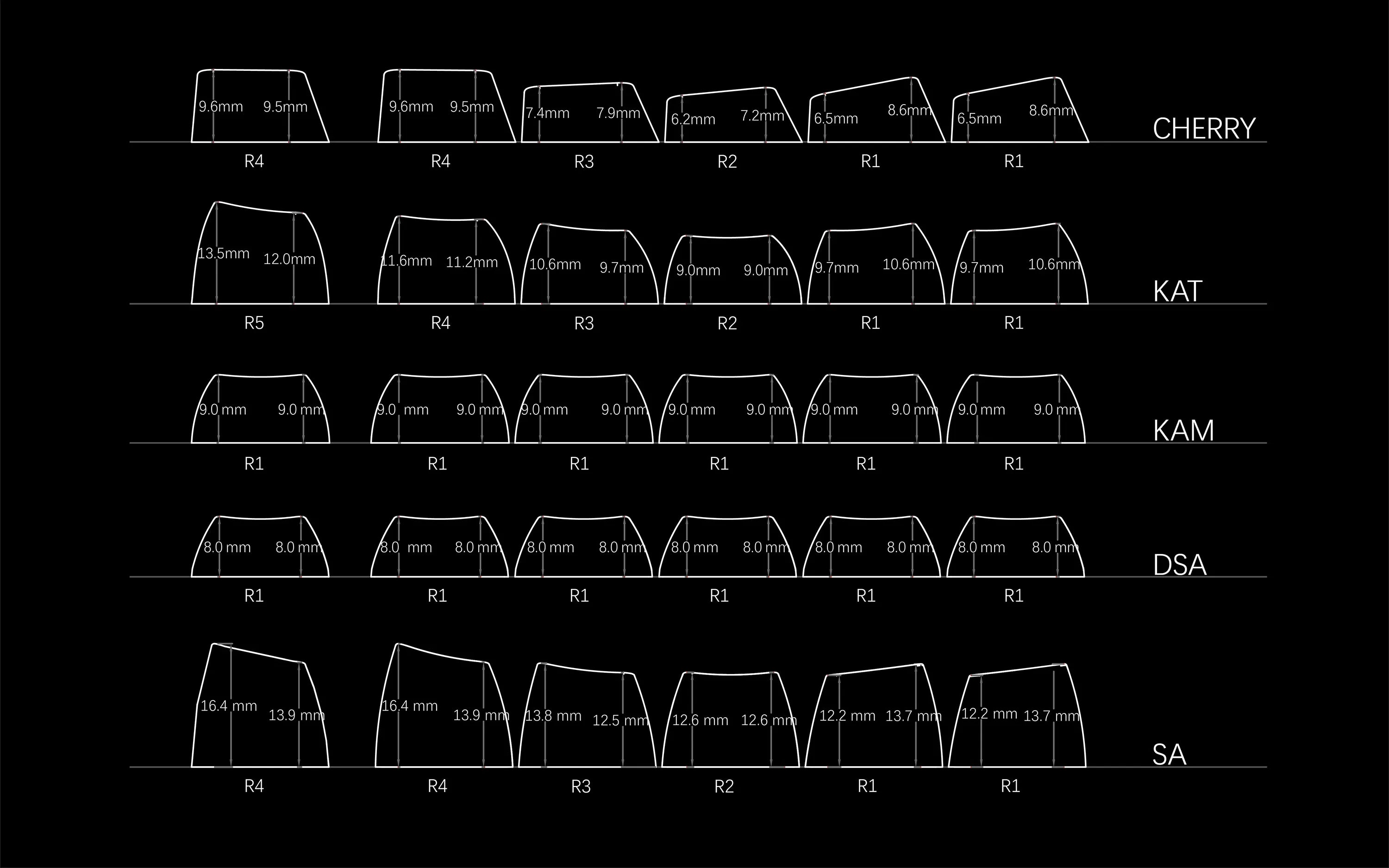
Profile Comparison
PBT content 85%
Made from PBT raw materials.

Dye-sub plus +
Exclusive craftsmanship
30%
increased clarity
15%
enhanced saturation
15%
improved positioning accuracy


You may also like
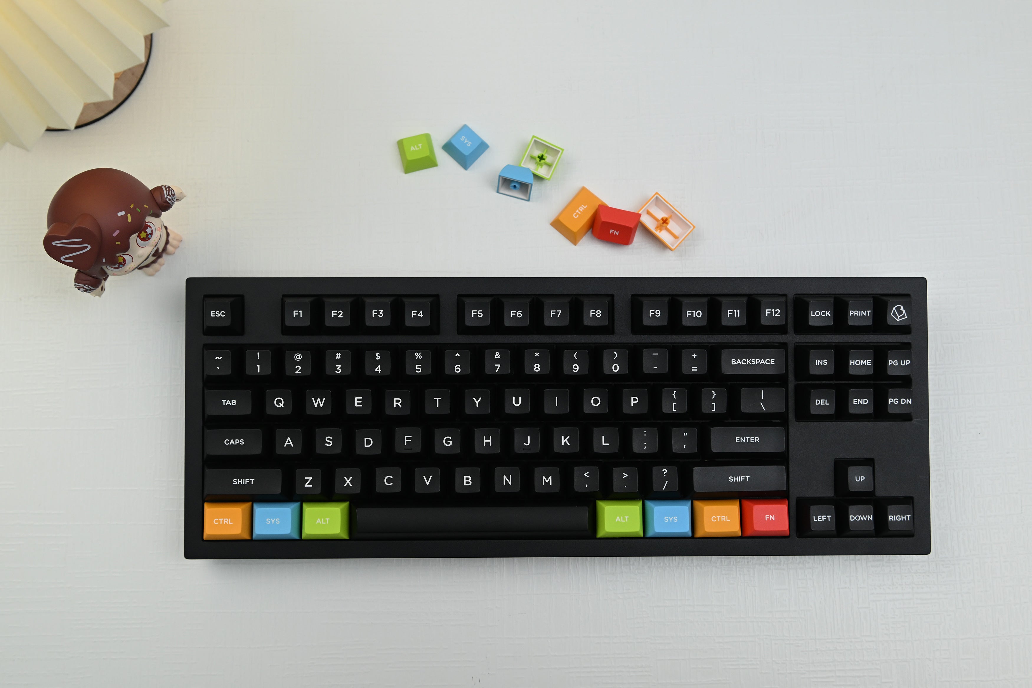
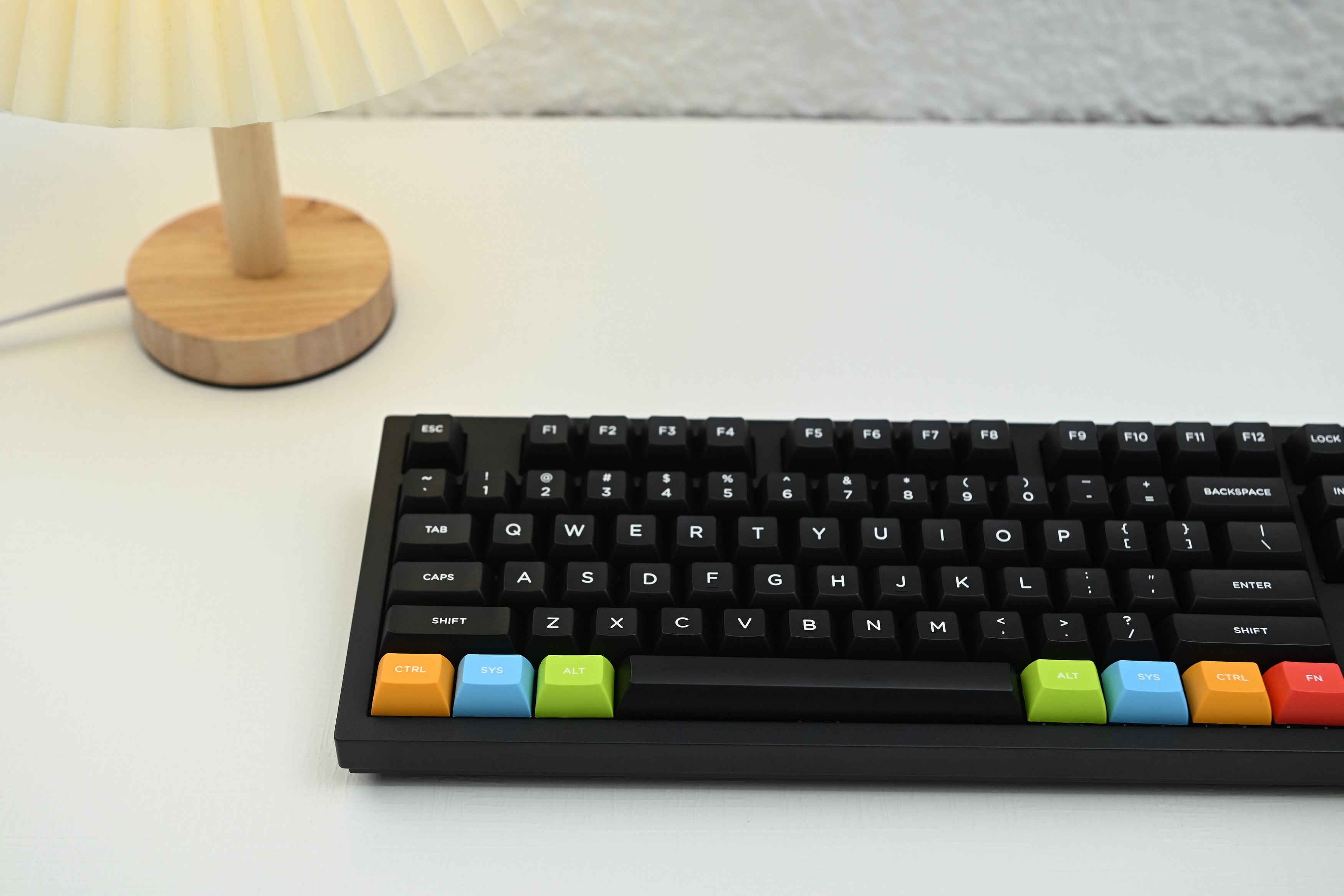
7 colors available
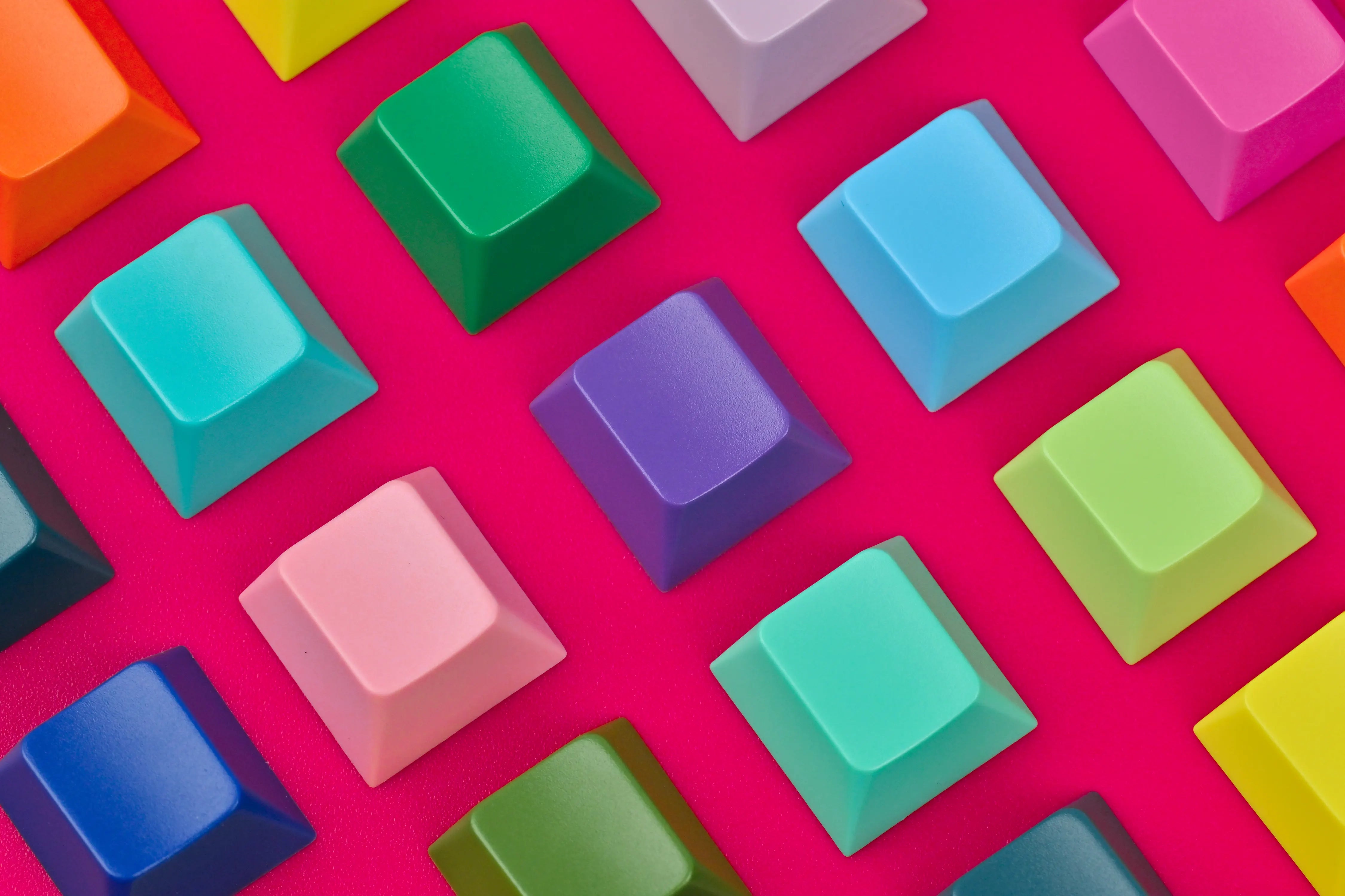
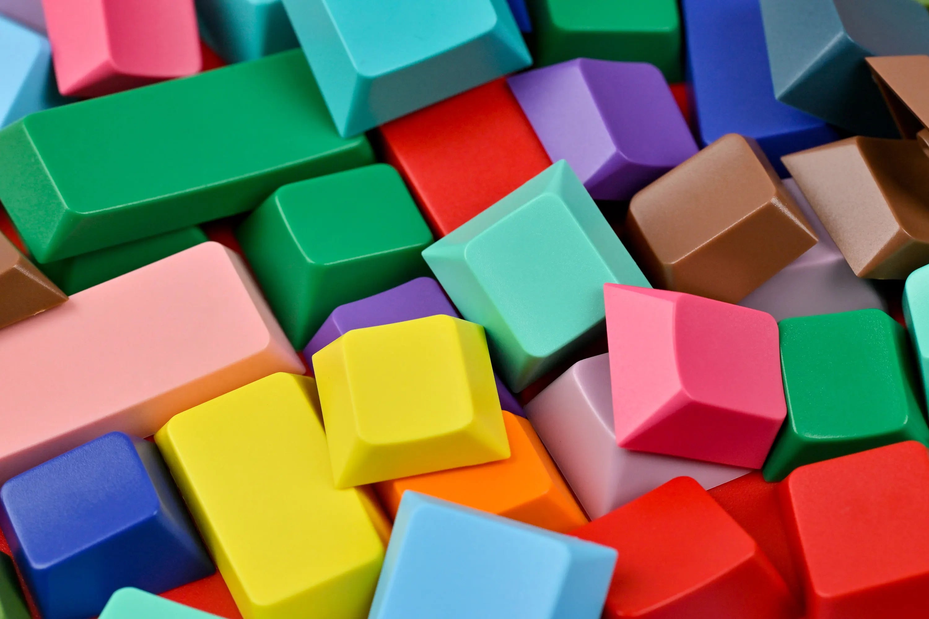
25 colors available


